How to improve Largest Contenful Paint
Learn to improve how fast your website loads.
Published August 20, 2025 (Updated August 20, 2025)
Today you're going to learn how to improve your largest contentful paint score.
I have seen website get up to 60% increase in performance after applying these tips.
The best part?
These tips work on any website, and you can make them even if you don't have much technical knowledge.
I will give you the complete list of things to work on and the possible impact of each item.
Let's start!
Why is your largest contentful paint performance so bad?
Largest contentful paint measures how fast your website loads. Scoring low on this metric means there are some issues on your website. Most commonly they are:
Large and unoptimized images
Slow server
Render blocking script execution (don't worry this won't be complicated to fix)
Large JavaScript and CSS files
Client-side rendering
If you haven't already, check if your website passes the core web vitals test. It only takes less than three seconds.
Let's go over each of them and see how you can fix them.
Optimize Images
Images are by far the largest resource a user has to load when visiting a website.
If you are going to focus on only one thing, focus on optimizing the images on your website.
To optimize images:
Use modern image formats
Correctly size your images
Lazy load images
Use modern image formats
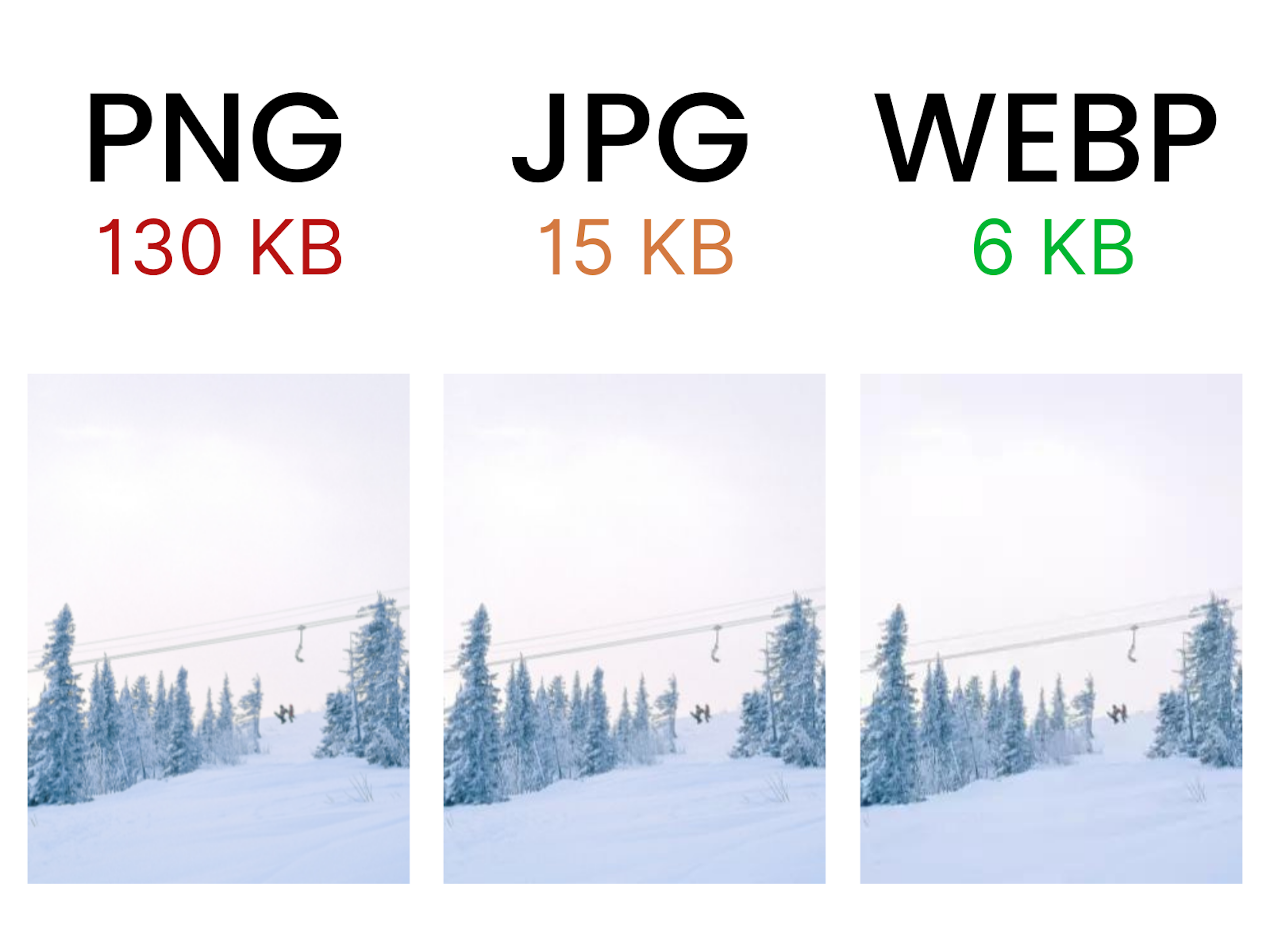
You have probably heard of image formats like JPG and PNG. But the one most optimized image format for websites is WEBP.
WEBP is the recommended image format by Google.
You can reduce image size massively without having any noticeable changes in the quality.
Convert your images to WEBP format using this free online tool.
Correctly size your images
Another major performance hog I see all the time is using too large images.
To figure out if you are using too large images on your website you need to first figure out what is the optimal image size for your website.
Go to your website on your PC or laptop and right click on an image and choose Inspect.
This opens up an inspector with the image tag highlighted.
Hover you mouse over this highlighted tag and you should see a popup on top of the image on the page with the rendered resolution.
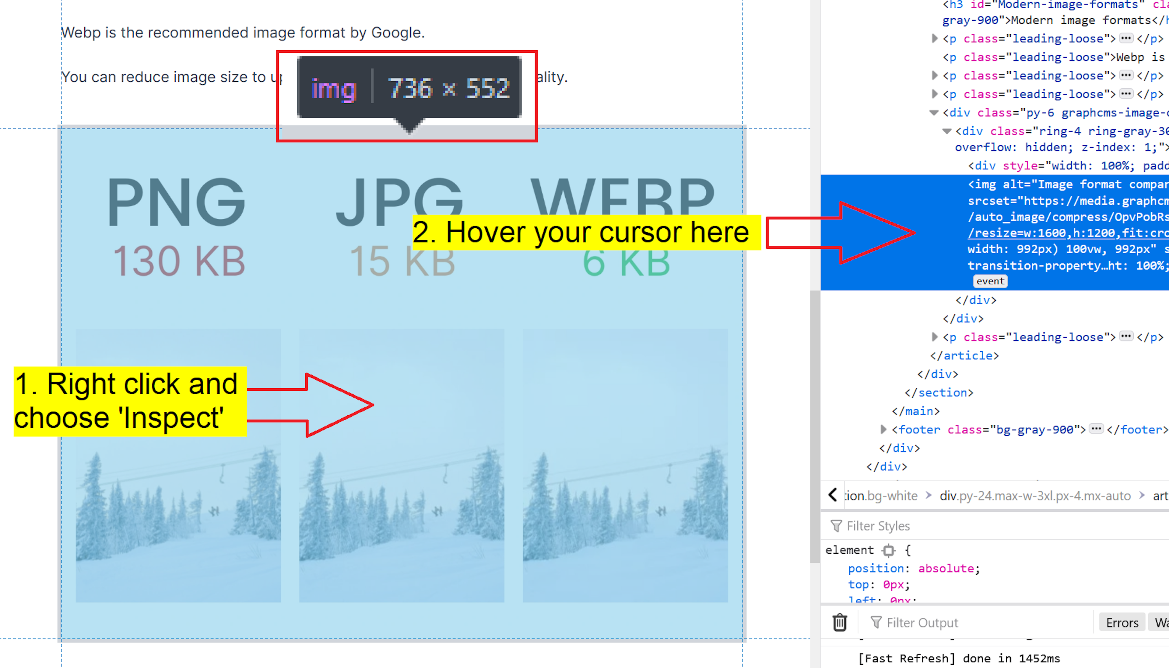
This might look slightly different depending on the operating system and browser you are using.
The first number (in this example 736) is the width of the optimal image resolution you should be using.
Resize the images on your website preserving the aspect ratio so that the image width hits this number.
More often than not, your content management system (CMS) should already be doing this automatically.
If you are not sure if your CMS is optimizing your images, send me a message and I can take a look for free.
Lazy load images
Lazy loading images means that your browser loads images only when they are visible on the browser.
Basically, users don't have to waste time loading images they are not even seeing.
This is a very easy to fix to make.
Add a loading=lazy attribute to your image tags on your website.
Your image tags should look something like this:
<img loading="lazy" src="https://example.org" />
Responsively load images
This is a step above lazy loading.
Responsively loading images means that the user loads the correct size of the image depending on the device they are viewing it on.
Smart phone -> small image
PC -> large image
Again, your CMS should generate these different sized images automatically but it might require some custom code on the frontend.
Here's the #1 guide to responsive images.
Optimize your web server
The server is the heart of the website.
This will be the most challenging step for non-technical people. If you don't know how to do all of these steps, send this article to your web developer.
To deliver your website files as quickly as possible to users you need to:
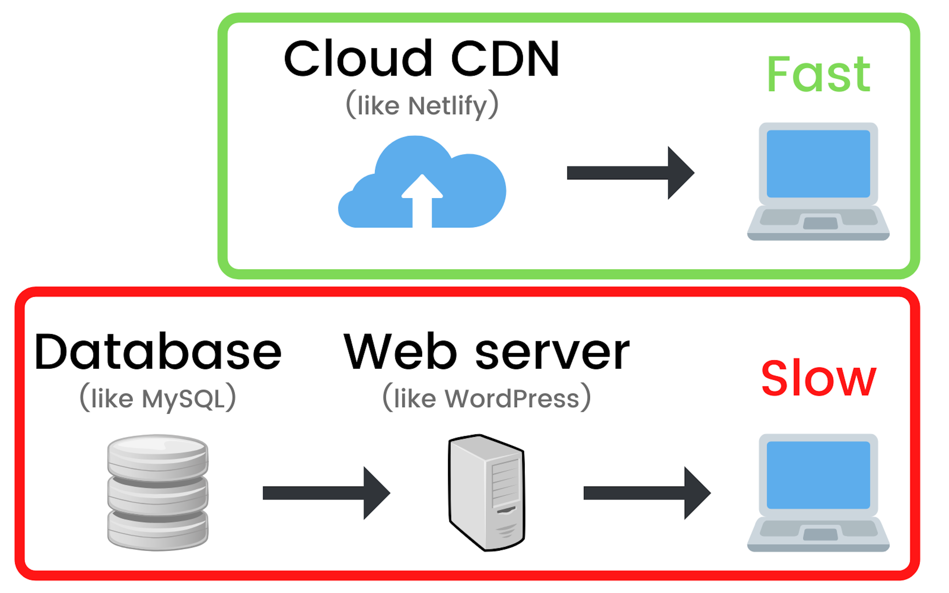
Statically render your website
Serve assets from a global content delivery network (CDN)
Many website builders like WordPress lack this functionality out of the box and require plugins or extra code to make it work.
Statically render your website
Making your website static means that you generate all of the pages and content ahead of time. This way when the users requests to see a webpage you only have to send them the static files.
The pros of a static website are:
More cost efficient. Serving static files from the cloud is incredibly cheap.
Global availability. Your website will be accessible from anywhere in the world without any extra effort.
More secure websites. Because the website resources are served from the cloud instead of from your server and database this reduces the attack surface for hackers dramatically.
Faster loading times. The website files will be server from a highly efficient global cloud which means users won't have to wait for your server or database response on each request.
If you don't know where to start take a look at a Next.js which is one of the best web frameworks. Especially if you are migrating from WordPress.
Static websites won't only have a big impact on the page experience your users will have but also for search engine optimization (SEO).
Static sites are easier to crawl by search engine crawlers which means you will have less errors.
Speed up JavaScript
JavaScript is responsible for all of the logic happening on your website.
Not all of this is required to load up the website at first and by delaying JavaScript execution you can get significant performance increases.
Examples of scripts you can delay are:
Google analytics
Facebook and other pixels
Widgets like Calendly or social share
Delay JavaScript execution
Add a defer attribute to your script tags you want to be executed after the document has been downloaded and parsed.
It should look something like this:
Minify and compress JavaScript
Minification of JavaScript is the process of removing any code that is not necessary.
The end result is smaller files that still work the same way.
This is an automated process that should be done every time you make changes to your website.
Compression is making files smaller by using algorithms like Gzip and Brotli.
Most hosting platforms and servers already do this so make sure it's enabled.
Conclusion
Use modern image formats like WEBP
Use correctly sized images
Lazy load images
Make sure your website is statically rendered
Serve your website files through a global CDN
Defer script execution
Minify and compress JavaScript files
If you have any questions on improving your largest contentful paint score send me an email or message me on Twitter.